Evaluation


I feel that my project meets requirements of the module and I feel that it almost lives up to my expectations, it could have been more polished and a lot more complex. But I am not a talented motion graphics artist so my response to the brief is more simplistic. If I had more time on this project I would have liked to be able to elevate the response and make it look more slick and more experimental rather than what I produced which was more basic, but this was just a proof of concept so it just needed to work and look similar to what could be produced if I had a team of people working on it and a company behind me helping me realise what could be better.

I am really happy with how the Adobe Experience design turned out, as I had not been able to use it in semester A due to it being a Mac OS Beta exclusive. I feel like it has turned out quite well and flows quite smoothly and helps me realise what potential this application has and how it could be realised.

My favourite part of the whole design process was the creation of the logo and subsequent logotype as I feel that they look really professional and cohesive with the whole design aesthetic that has been achieved. I brought in skills I had acquired in Semester A of another module II have taken at Level 2, design, I feel like taking both of these modules has helped me realise that they go hand in hand. I am pleased with how the whole aesthetic looks in the concept realisations and mock ups it really brings the concept to life and gives a potential to the whole project.


Fitting into a wider media industry I feel like my product could easily make it into the app store and help impact climate change in a positive way. I also feel like it could possibly fail as a new game comes onto the app store everyday that becomes successful and dwindles after only a few days. Also making a game like Awaken is quite costly and would need to not only be backed by a large investment from companies but also by possibly a crowd funding site like kickstarter.


But overall I feel like my product realisation has been a success even if I do not like it as much as I possibly could the, app fits the criteria and ticks the boxes so I am happy with how it has turned out.
Personal Reflection

Personal Reflection


Reflection of the project, I am happy with the outcome that I have produced, I am not overly happy but this is because of personal feelings towards the module and the structure. I really like being told a structure to follow such as a baseline brief that could go many ways. I feel like I shut down when doing this brief as I did not have a solid idea which set me back as I did not produce anything solid till around week 5, which is a lot of time to waste. I did not like the idea of such an open brief but that is just a personal gripe that I had as my mind does not just like the idea of doing one thing for 12 weeks like this task of do a brief, which is a personal flaw. I feel like the outcome of the project was decent but there is a lot I could do to improve my response to the brief.

The proposal I ended up doing was a game design that could help raise money through advertisements and help tackle climate change. I went for this because I felt like this is what I wanted to produce and I was quite stubborn to other ideas once I set my mind to a task. The main aim as to produce something that could tackle the topic of climate change in a way that was not too much spoon fed to the audience but tickled into the game around a dystopian not too distant future. What I do wish I had done was to do interviews and target groups to see how they reacted to the motion graphic. Also, I wished I had done more genre research but because of lack of motivation and time this as not achieved and is something that if I did this sort of task again I would do more, I also read a book that would have helped with a task like this but I did not get time to do a full analysis or read the full book because of time constraints and having to do other projects at the same time.

Aesthetically I feel like this app is really nice and modern, there is a nice mixture of skeuomorphism design and flat design. I wish I had spent more time doing more assets and designs as I feel like I rushed them and didn’t really reflect what could have been possible with the 12 weeks.

I feel that I did enjoy the challenge of designing an app in the end couple of weeks but I wished I had thrown myself into the task much earlier so I could have elevated the motion graphics more and created a Symbiotic multi touch point marketing campaign.

I feel overall that I have made the app to a satisfactory standard and that is all I could wish for but If I were to do this again, I would think about elevating my product to a higher standard.


Logo research

Untitled-1


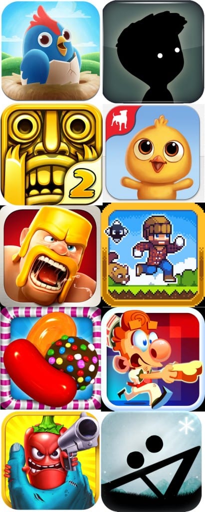
I wanted to look at existing game icons before rushing into my own. I want to portray in my design that this game is eco oriented but monochromatic. something that is fresh yet black and white, modern and something that stands out. I want to have it be easily accessible amongst other apps and have it be recognisable small as I ave been critiqued many times before about my logo designs.

Marketing

Marketing

According to Fiksu research, it can rake up $200,000 in ad expenses to push an app into the US top 25 iOS app ranks. Canada is a bit cheaper at $15,000. In Germany, top app ranks can easily cost $65,000 in advertising expensive; $45,000 in the UK, $30,000 in France, $35,000 in Brazil and $10,000 in Thailand.


Meaning I would need at least $260k+ to get the app into the top 25 iOS apps section in North America and the United Kingdom. This means that I need over $300k to get this app to succeed in a sense, this is quite a daunting number which could in part be funded by a crowd sourcing campaign like Kickstarter or Indiegogo which would help but also it would need backing from a developer who could put money into the project.